
Utah Drought Visualization
In my home state of Utah, we're no strangers to droughts. This week for #TidyTuesday, I was interested in how the past two years have compared to other stretches since 2000. I walk through getting the data, creating my visualization, and personalizing it.
#TidyTuesday is a weekly community project that distributes a tidy dataset from which users create unique and interesting data visualizations. From honey bees to dog breeds, baby names to the US drought. The community inspires and teaches insight derivation through data viz.
You can find all the info related to #TidyTuesday via their GitHub Repo.
I've long desired to participate and decided this week's data, concentrated on the US Drought plaguing the nation, was the perfect opportunity to get involved. It didn't hurt either that I've been honing my visualization skills in R recently.
Accessing #TidyTuesday data is simple: install the {tidytuesdayR} package, load the package as a library, and use the "tt_load()" function with the corresponding date as a parameter.
I took some inspiration from a density plot that grouped data by a y-axis variable (see below). I thought these density reidges would work very nicely for the application I had in mind! Thanks to DataNovia, I was able to get the bare bones working upon which I could addd some personal touches.
This is a visualization I've never tackled before. Originally I thought a density geom with the year groups as the y aesthetic would do the trick. Unfortunately that wasn't the case so I referred to the code that generated the above visual as an aid.
I realized the {ggridges} package made this kind of visual possible and its "geom_density_ridges()" with a group aesthetic accomplished what I was hoping. It took some trial and error but I successfully created a base visual!


After a little trial and error, I realized I was interested in using a gradient fill to show how the drought score (DSCI) interacts a little more visually with each year. Hence, I used the "geom_density_ridges_gradient()" from {ggridges} and achieved the above.
Next up was to add basic elements like the title, axis label adjustments, and legend titles. I then began to tackle some of the overall theme. Being an avid NBA and Utah Jazz fan, I opted to use a theme similar to the Southern Utah, gradient jerseys of the past couple seasons:

I used a dark background with white text and gray major grid lines. I then used a dark crimson as the "low" for the gradient and the blazing yellow for the "high". The result turned out nicely!

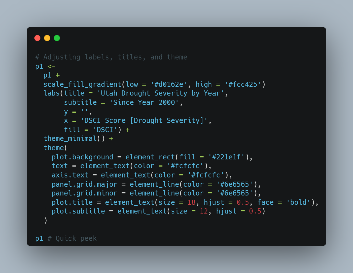
You'll notice that I used "theme_minimal()" upon which I added my own adjustments. I really like the clean look of that theme and I usually only require minor changes before achieving a very nice looking plot!
To finish up the plot, I wanted to highlight some important components. For me, that naturally meant a short text label and some sort of adjacent shape (i.e. arrow).
I wanted to point out which direction on the x-axis was desireable and address the severity of the last two years' drought relative to the past two decades.
The result turned out pretty spectacular, if I do say so myself:

I learned a lot during this brief exercise, particularly how to create density ridge graphs. I got a little exposure to a new package and look forward to exploring it in more detail for the future.
I also got some hands on {ggplot} practice drawing shapes like lines or arrows and placing them in regions I desire.
I look forward to future #TidyTuesday challenges and stretching my abilities with data visualization. Refer to my Tidy Tuesday Repository for future challenges and contributions.