ggplot2 Learn and Practice
Visualization is the crossroads of information sharing and true learning, which often translates to being the paramount step of communicating insights from data analysis and machine learning. I work on improving my visualization skills using ggplot2 and its extensions in R.
Project Introduction
Data visualization is often the mental bridge that enables complicated insights to be distilled enough for humans to "connect the dots", so to speak.
I feel it's important for every data professional to have a degree of proficiency in data visualization. Whether you're an engineer needing to diagram complex machine learning pipelines, a scientist communicating machine learning results, or an analyst breaking down the structure of the data.
Visualization is a tool for everyone.
Situation
Despite my familiarity with R, I remain a novice with visualization. Outside of basic scatter, line, histogram, and box plots, I don't have much exposure to the other tools out there.
I became quite proficient with R's base plotting functionality before reaching its limits and struggling to incorporate basic features. {ggplot2} is a the pinnacle of visualization packages for R that's standard in the industry. In this project, I look to take my skills to the next level.
Task
There are so many visualization tools prime for learning and practice. Much of the inspiration for the charts I'd like to create in this project come from DataVizCatalogue.
My goal is to gain exposure to many types of visualizations common in the industry as a way to learn about their strengths/weaknesses, to build up my knowledge of what's possible, and finally to build a personal resource for future data viz reference.
Action
Unlike many of my projects that result in a series of blog posts in long form, I've decided to link via the project components below to the GitHub repositories where one can see the code, examples, and README files for insight into my process.
Result
In the handful of weeks I've focused on data visualization via {ggplot2}, I've found some tremendous success. I've create various interesting visualizations and learned a lot about how the package works and a great deal about its other extensions.
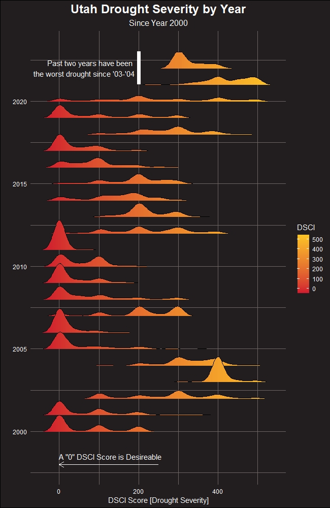
Here's an example of something I created recently for the #TidyTuesday (weekly data viz community exercise) submission: