
Disney Height Restrictions Tool
Planning your Disney Amusement Park visit is a fun experience but often travelers neglect attraction height restrictions affecting their group members. This tool makes it dead simple!
I love solving problems with data and programming. Even the simplest of annoyances and disruptions are in fact opportunities to problem solve.
One such problem we've run into as my incredible wife organizes family vacations to Disney parks is planning the attractions we will prioritize with two young kids.
As with most theme parks, certain rides require a certain height from passengers. I wanted an easy way to evaluate attractions my kids could go on. I thought to myself, "A Shiny app could do that!"
Data Gathering
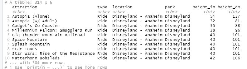
I knew that I wanted a more feature rich data source than "attraction_name" and "height_requirement". For example, Disney has many locations (i.e. Disneyland, Disney World, etc.) and within each parks (i.e. Animal Kingdom, Epcot, etc.). Furthermore, not every attraction is a thrill ride. I believed these attributes were essential from the application.
The data was scattered everywhere. Even official Disney websites presented incomplete information. After a few hours of manual data collection, I finally had a couple data set to feed the application. Here's a peak:
Building in Shiny
A shiny application is easy enough to get started in RStudio. By selecting "File" - "New Project" - "New Directory" - "Shiny Application", we can name the project and RStudio will setup the structure and a source file with a simple Shiny app code.
From there, we get to customize to our liking. I'll start with some housekeeping so we have everything we need.
Setup
We'll first put our dataset, "attraction-heights.csv", in the directory for easy reference. I also imagine using some sort of Disney castle image. A quick Google search yielded the below. We needn't download but can reference in the app with the image address.
We'll also be overwriting the default bootstrap css styling so we need to create a folder in the directory named "www" inside of which we'll place "style.css". We'll edit that later!
I think we're ready to edit our "app.R" file now and build the app.
Layout
Shiny has some nice, out of the box nice layouts with sidebar panels and/or tabsets at the top. They are a real nice avenue when layout is less important and the focus is functionality; you get to spend time on the application without beating your head over layout.
Neither of those stock layout options made much sense for my application and the vision I had. Instead, I wanted to practice creating a custom layout. Here's a basic diagram of a creating a custom layout:
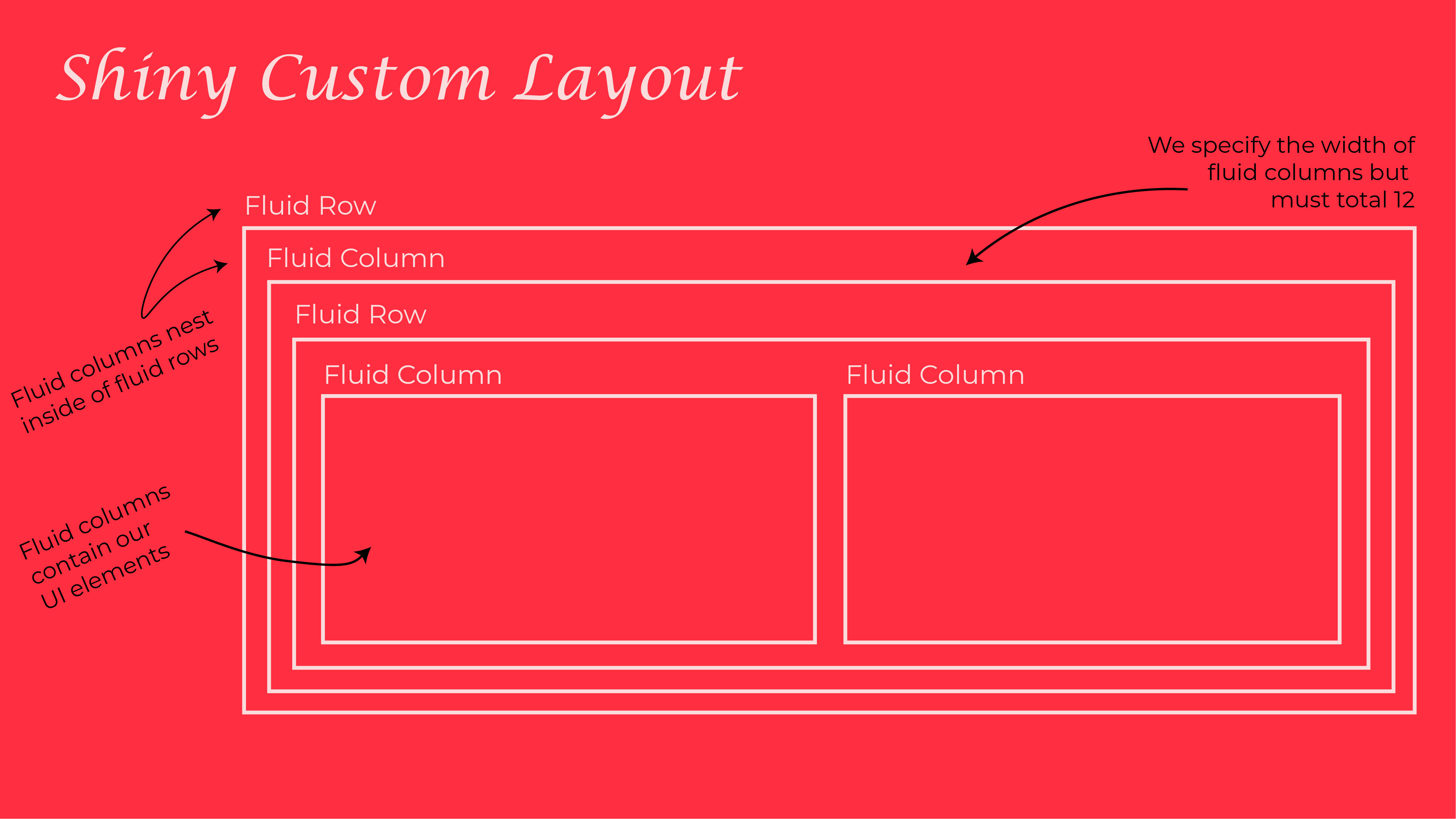
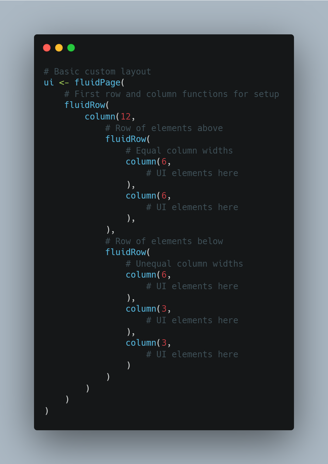
A custom layout is made up of fluid rows and columns (fluid because they use responsive CSS that will adjust to be friendly for all devices). To start, we need a fluid row and a column therein specified to a width of 10. This defines our foundation. Here's a basic example with code:
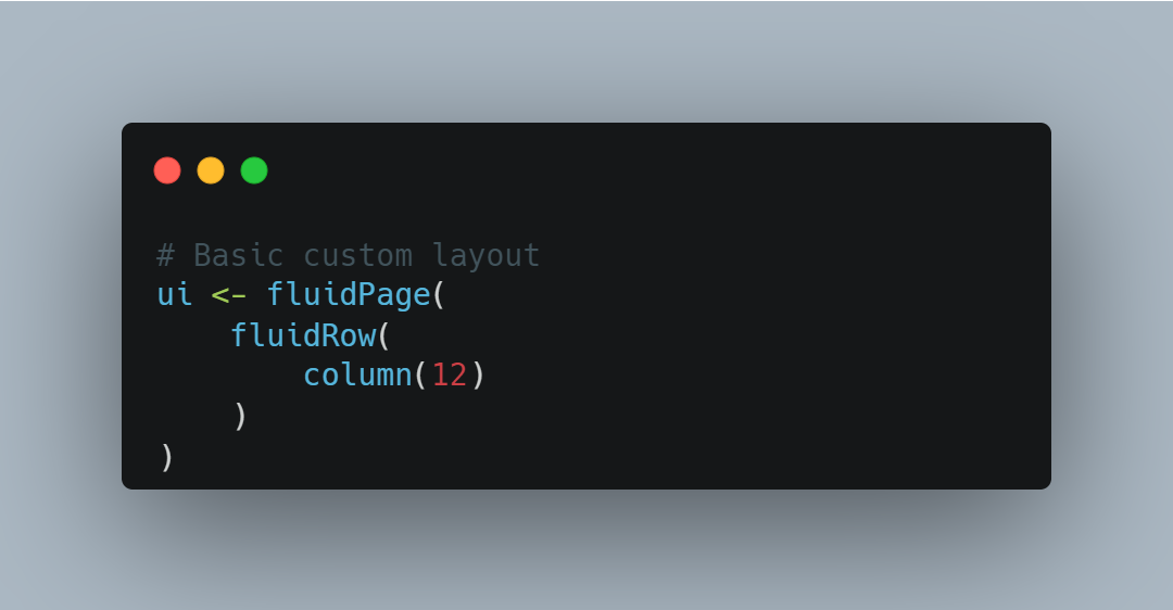
It doesn't actually do anything from a user's perspective but rather informs the browser of how we're defining the display. From there, we can nest more rows and columns, customizing their width, and placing elements within the columns we choose. Here's a snippet of code showing how we can nest rows and columns to create a layout suiting our needs:
Given this kind of a structure, we can imagine a layout with input fields at the top and chart/table displays below. I also imagine the castle image above being the background and using custom CSS styling to adjust fonts and colors. Here's a diagram:
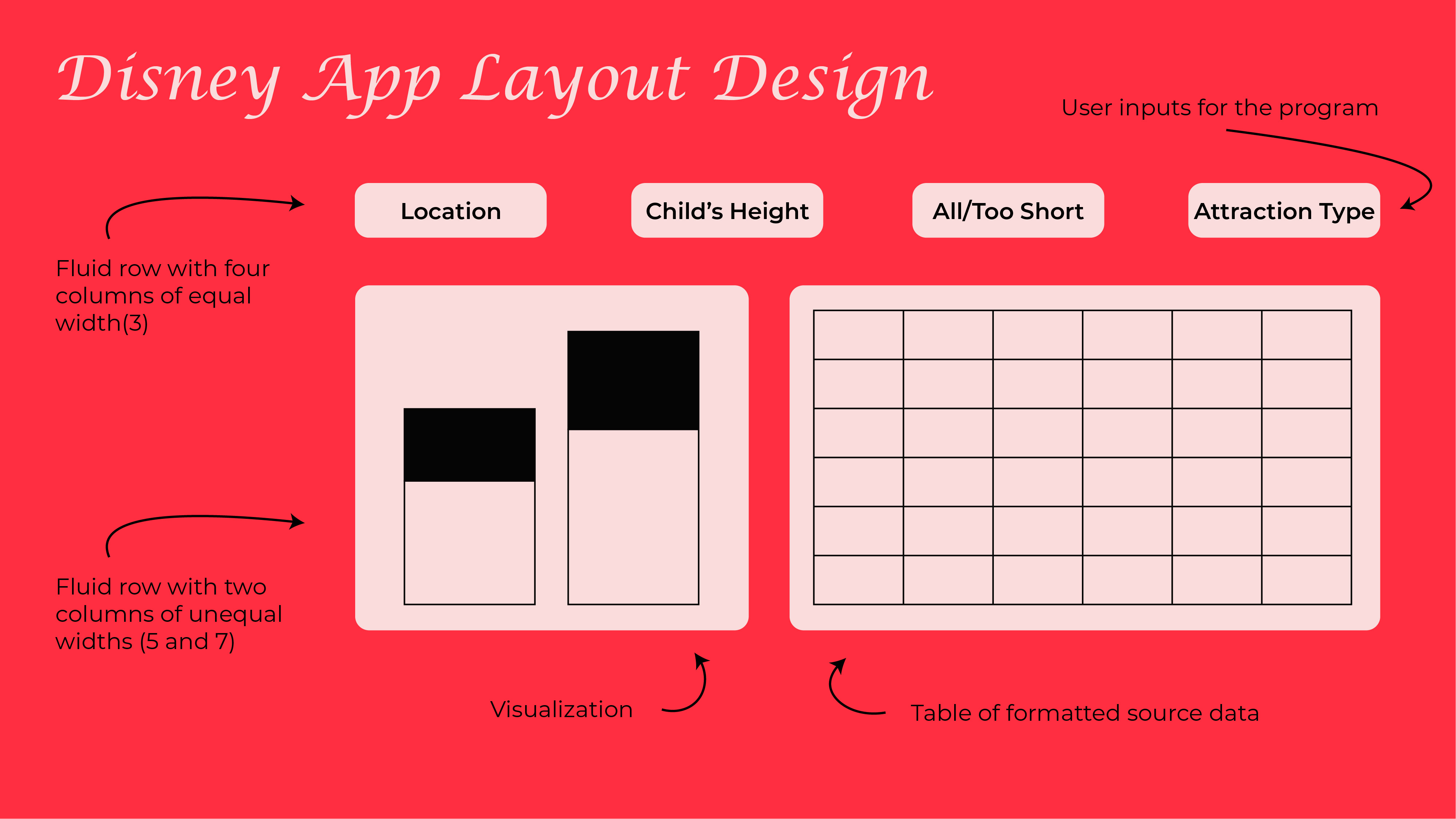
This layout would give the users control over the data and how its presented, give them a visualization that'd be helpful for visual learners, and offer finite data in the table. Thanks to custom layouts, this vision is aboslutely doable.
Table
We'll need a table in the Shiny app to display the detail. There's a few packages out there I could have used, but I really liked {reactablefmtr}. The customization with the table formatting and some conditional capabilities I thought suited this project. Here'x an example table demonstrating what's possible:

The data displayed in the table will follow a transformation pipeline before the table formatting. The pipeline will implement:
- A filter the location based on the user input
- Selecting relevant columns to display: the park name, the attraction type, the attraction name, and the height restriction
- Adding a column for the conditional formatting values
- Filtering the attractions for the user input on "All/Too Short"
After implementing the transformation pipeline, we're left with defining the table. Here's the code for outputing and formatting a reactable table:
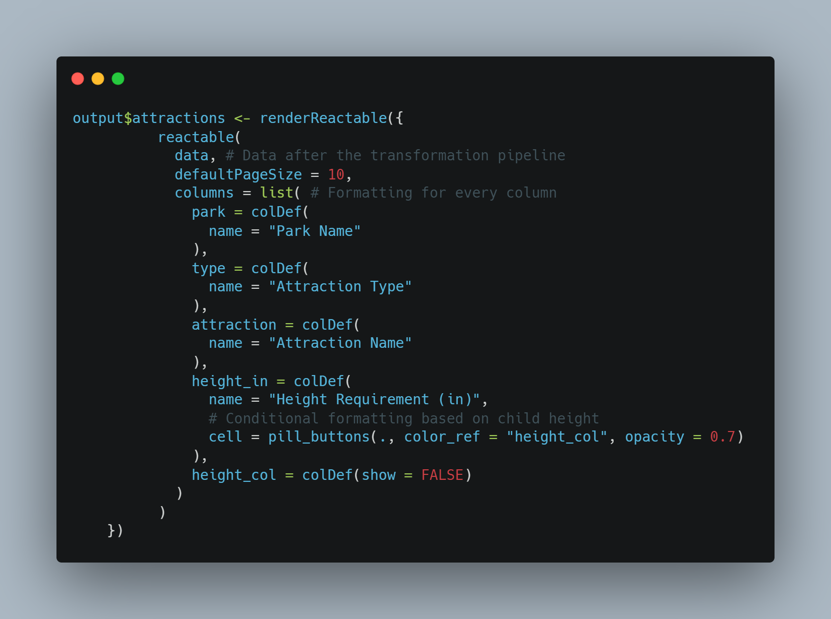
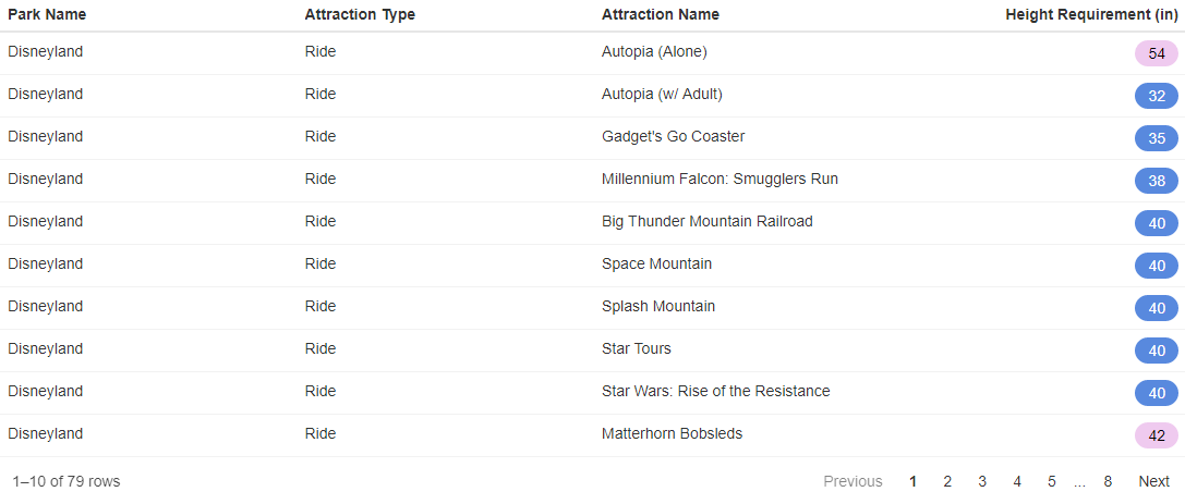
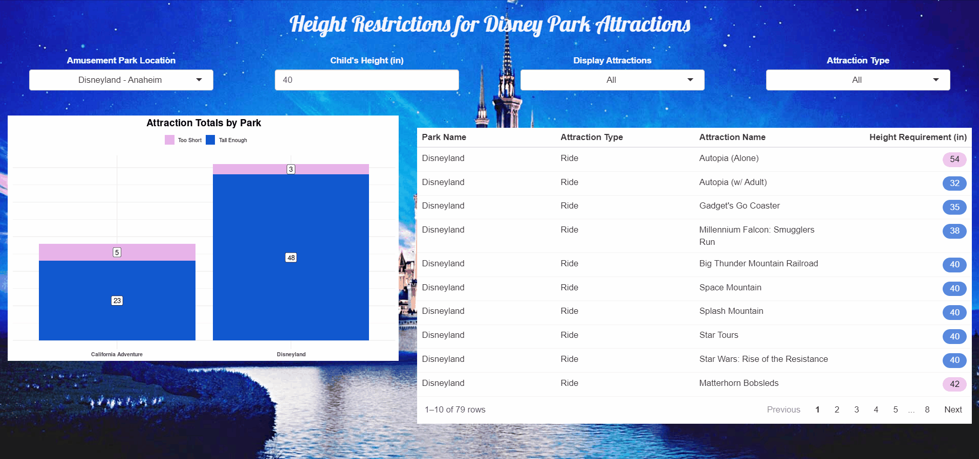
What we see here is a "reactable" function, in which we specify the data source ("data") and in the "columns" list we specify formatting by colume, including the name and in the case of "height", conditionally formatting the color based on the 3rd bullet above. We end up with a beautiful table like this:
Plot
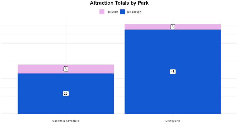
We also need to design a visualization based on user input as well. I really want to demonstrate how many attractions in a location a child is okay or too short to ride by park. This would, for example, give parents an idea of which park to prioritize during their vacation.
We'll use a modified transformation pipeline from above to make our visualization more rich:
- Filter based on location and attraction type
- Add a column with a two value factor of "Too Short", "Tall Enough" dynamically based on the height input
- Count the number of attractions by park and height status factor
- Arrange by ascending park name and descending height status
- Group by the park
- Add a column for the label's position on the y axis
From there, we can define the output and formatting of our visualization. Here's the code we'll use to create the plot:
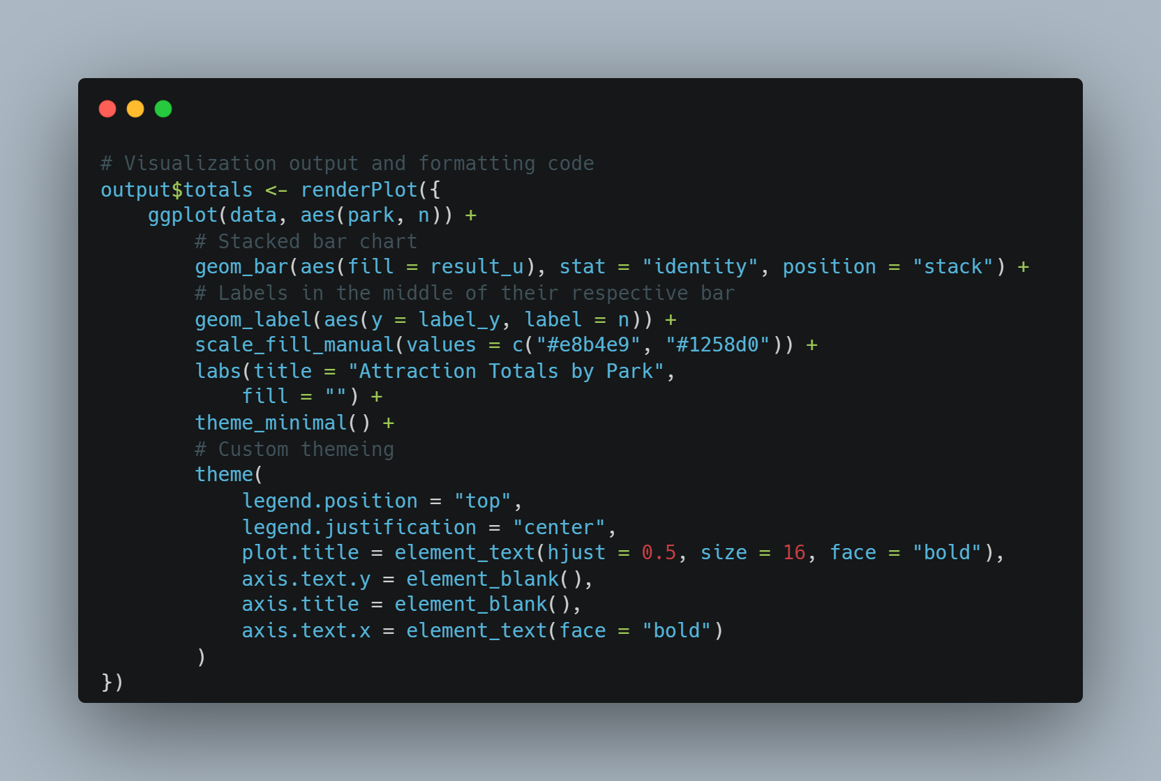
What we see here is a "reactable" function, in which we specify the data source ("data") and in the "columns" list we specify formatting by colume, including the name and in the case of "height", conditionally formatting the color based on the 3rd bullet above. We end up with a beautiful table like this:
Putting It Together
We've got A LOT of the pieces defined; now it's time to put them all together in a working application. An outline should help organize all the pieces:
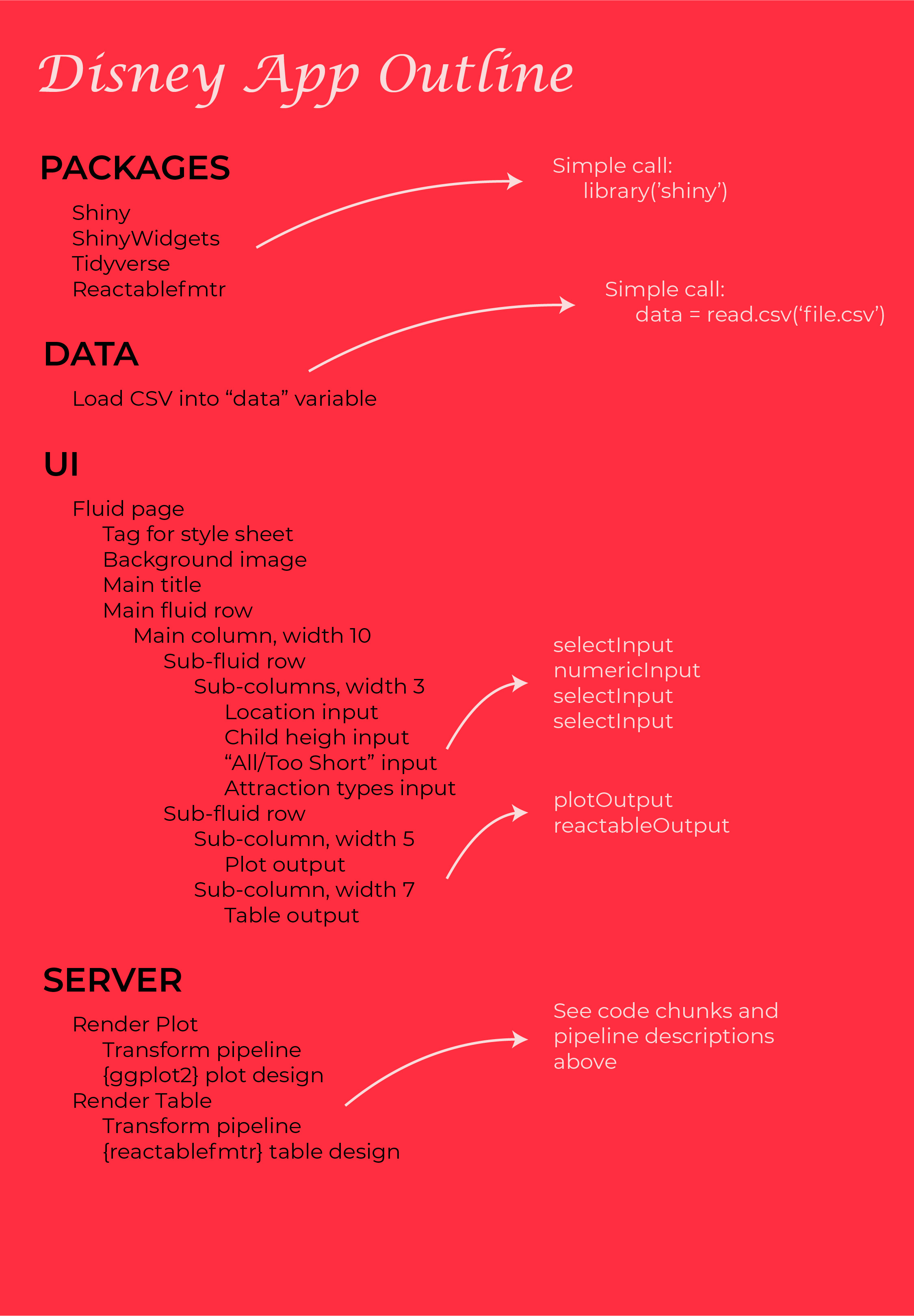
Following this outline, we can organize all the components in sequence. As explained in my first Shiny app, the UI and Server talk to each other and pass objects. The inputs defined in the UI are accessed by the Server while the outputs defined in the Server are accessed by the UI.
Deploying to RStudio Server
After completing my first Shiny app, I knew I wanted to learn how to deploy the app. Sure it's cool that it works, but it does little good on my local machine. Once it's accessible to prospective Disney vacationers around the globe, that's when our data work changes the world.
I found a great resource to guide me through, what ultimately became a really straight forward process:
Now the app can be accessed throughout the world and you can check it out HERE.
Demo
Take a look at the .GIF below for a short demo of the completed program!
You can also explore the application currently hosted on Shiny: Disney Attractions Height Restrictions.