NBA Data Visualizations
As a hobbyiest NBA blogger and super fan, I'm always looking for new ways to understand the game. I developed a handful of metrics and perspectives about which I wanted to create tools for visualization. "And now presenting, Tableau."
Those who know me personally or who have perused my Twitter account know that I am a major basketball fan, particularly of the NBA and my home team the Utah Jazz. Because of my personal interest and love for data, joining the two loves is about the biggest no-brainer.
I'm always looking for better ways to understand the game. Traditional box scores on the one hand lack the nuance and context necessary to judge results while on the other extreme advanced stats like FiveThirtyEight's RAPTOR encapsulates and summarizes too much from our view.

While I reguarly query both resources, I've always felt a middle ground accomplishes the majority of analysis needed. I aim to create some tools for personal use at the onset and ultimately scale for wider use.
The Metrics
I've developed a handful of metrics for which I'm interested in developing a data transformation and visualization workflow. These metrics use widely available data but are calculated and defined in such a way as to isolate specific circumstances I feel are impactful in today's NBA.
Let's define each in turn:
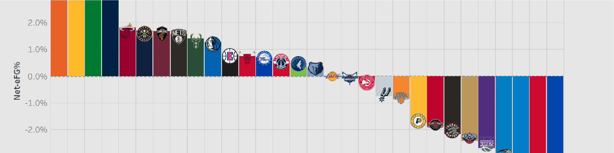
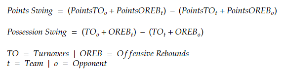
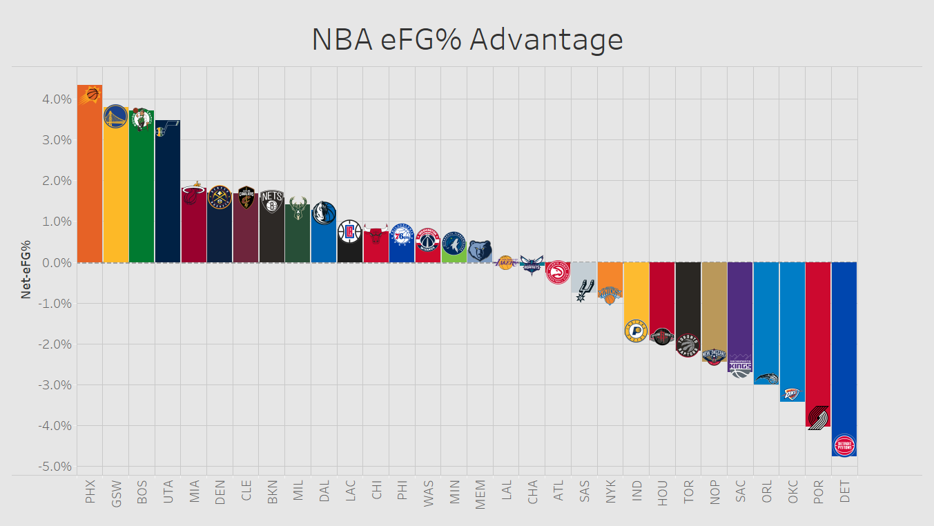
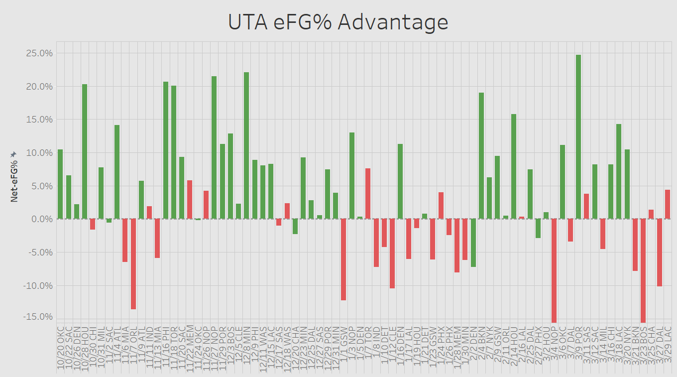
eFG% Advantage
This metric could also be termed "Net eFG%", "Net Efficiency", or "Shooting Advantage". It's not anything ground breaking, really. The degree to which a team is more efficient than their opponent increases the probability of a win.
The data point is calculated simply:
In short, evaluate a team's efficiency over that of their opponent. The more positive the result, the more of an "advantage" is had by the team. The inverse is true for negative results.
What's particularly fun about this calculation is our ability to go macro (evaluate entire seasons, eras, and historical comparisons [need to be careful given efficiency has improved over the history of the league]) while also allowing for single game preparation and evaluation.
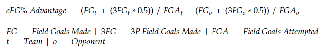
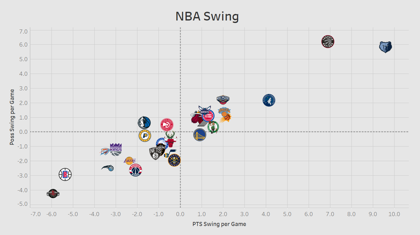
Points/Possession Swing
This metric is far more technical, but boils down to the simple reality that volume is an important piece of efficiency.
We all know this intuitively. You can make $100/hr (efficiency measure) but only have enough work for 5 hours a week (volume measure). Volume is an important component of lives and carries over to basketball.
I wrote an entire articles about the impact of volume for SLC Dunk: The Jazz's next step for improvement is valuing possessions and Opportunity abounds for the Utah Jazz in scoring volume.
Because of the shot clock and the "every-other" nature of possessions in basketball, team's will naturally have equal opportunity for possessions...unless they are "swung" from the opponent.

Offensive rebounds (securing a shot missed by one's own team) and turnovers (changing possession before a shot is a attempted) are the two primary ways to "swing" possessions and gain a volume advantage. "Points/Possession Swing" aims to calculate the difference in the swing of possessions.
The data point is calculated as follows:
In short, the possessions and points a team gets (via forcing turnovers and grabbing offensive rebounds) minus those gathered by the opponent is how many possessions are "swung". This measure is important as team's can overcome a poor night of efficiency or make up ground against a superior scoring team. While not as important as efficiency, it helps tell a vital story.
The Data Tool
To accomplish my vision of a data transformation and visualization workflow for these metrics, I wanted to use Tableau. While no doubt a powerful tool in its own right, it's a program I've had some prior experience with (directly and indirectly via other BI platforms) and was eager to develop my skills.
My first goal was to procure the data, setup a basic workflow, and design the bare bones of the visualizations and interactivity. The second goal would be to design automated data retrieval, design dashboards, and setup public facing pages.
This post deals exclusively with the former.
Transformation and Visualization
It became clear that the fastest method for retrieving the data was manual transfer from the NBA's Stats Page. Granted, a very ineligant and brute force approach, I was eager to produce a deliverable and evaluated the cost-benefit analysis to be worth it in the short-term.
The data is housed in .XLSX documents that feed into Tableau. Most of the transformation is handled therein. It's comprised of team data at a per game level since the 2017-18 season.
A powerful component and feature of Tableau is its ability to render images in a visualization in place of standard shapes, such as would be used in a scatter plot. This meant team logos (and subsequently team colors) would enrich the visualization.
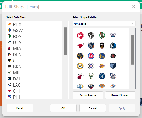
A lot of legwork had to be done on this front to scale and format team logos and colors correctly, while also associating them to the correct factors from the data source. The result was incredible. A little extra time to define some additional theme components produced stunning visuals.
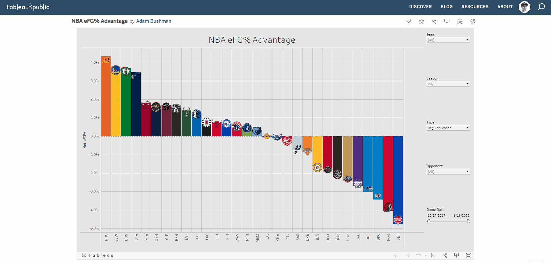
Take a look at some of the amazing visualizations such data and setup fasciliated:
All of these visualizations feature filters that allow for macro and micro analyses. See an example in the below .GIF for a demo of what can be accomplished via the public facing Tableau page accessible HERE:
Demo
There's plenty of work left with this project but it's rewarding to use a relatively new tool, solve some complexities, and produce amazing tools. I regularly use these tools to evaluate the league and my personal team, as well as to enrich the content I publish to SLC Dunk.