Building a Portfolio References Section
Professional resumes often sport a small section for professional references, who are seldom contacted during a hiring process. Instead, I envisioned a section of my portfolio that would capture the spirit of this component while recognizing how people realistically interact with it.
Professional resumes often have a small, regularly ignored section for references. They general consistent of a name and contact info, are rarely inspire hiring managers to consult them about the candidate.
There's a lot of perceived bias and questionable reputability with how most approach resume references. Like it or not, that's the reality of the process.
Portfolios offer a great medium to communicate far more than a resume. You aren't confined to a single page and optimizing its content to stick out among dozens of applicants. Portfolios offer the opportunity to tell a story and craft a value proposition.
The question in my mind was how to leverage the inherent benefits of a portfolio into resolving the inherent issues with references?
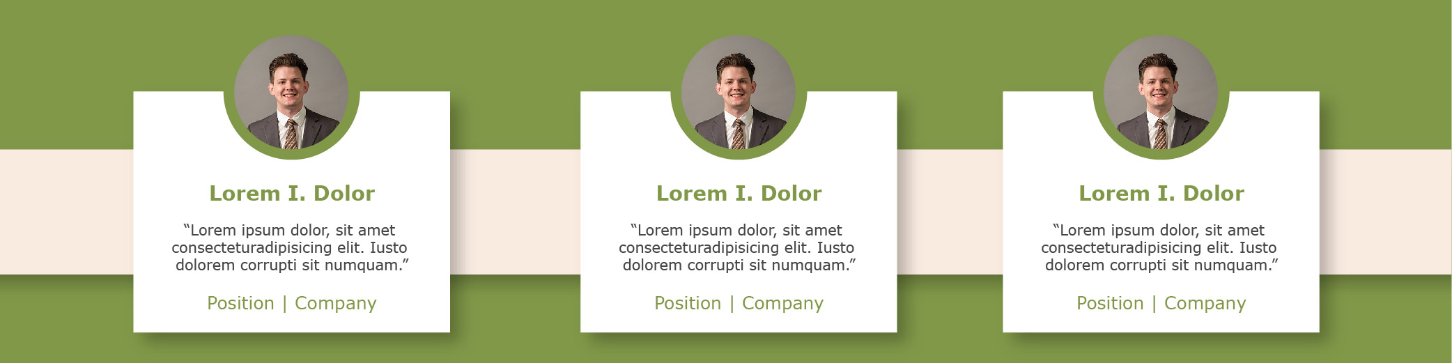
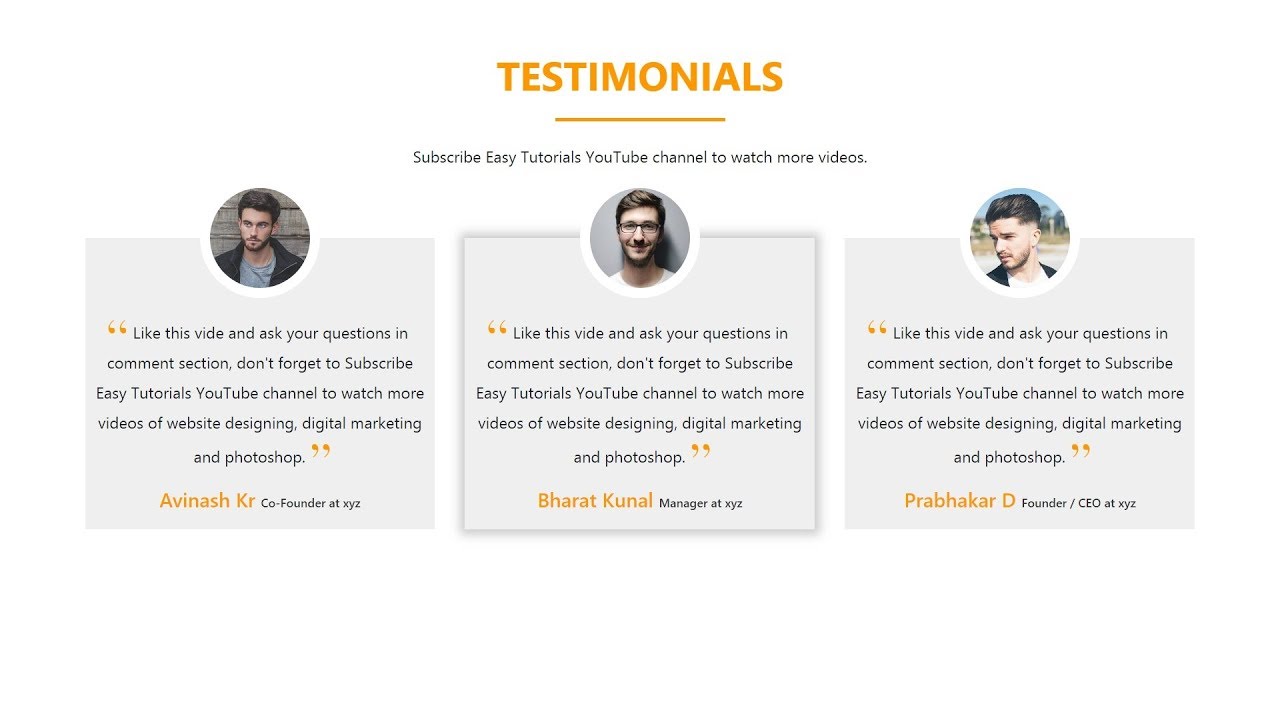
As I contemplated this issue, I was reminded of how testimonials of products or services are displayed. Instead of abstract contact info, a short statement is the highlight, sometimes accompanied by a photo and/or name and hyperlink. I found the below when scouring the web and decided it was the model for addressing the reality of professional references.
This format resolves the concern of reputability because you can cite someone's credentials and provide instant access to their LinkedIn or other profile pages. Furthermore, it recognizes that hiring managers will seldom make contact and provides a power statement about the candidate. Thus, we accomplish everything a reference is intended for without resigning to how it's used in practice.
I sought to create this for my portfolio website and acquire the necessary components and permissions from my professional references. I built the framework from scratch using my current HTML/CSS knowledge. It was a great way to test my abilities, while also learning and growing with a small project.
If you're curious about the build, consider watching the video below. I also detail some of the issues I dealt with and how I resolved them below.
Build Video
Problems and Solutions
Overall, the build was very straightforward. I correctly organized the content into the right tags and was able to style everything with relative ease.
The core issue I ran into was the photo. I wanted to achieve a similar look as the testimonials photo above which required the photo to stick halfway out of the quote box and appear as if it were floating.
I knew the approach would be to have a circle behind the photo colored the same as the website backdrop. This would achieve the halo, floating effect I was looking for. However, the problem remained in how to put it half-way out of the box and not leave too much blank space.
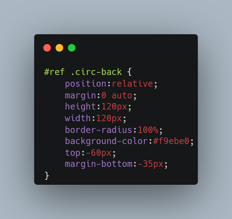
I ended up using relative positioning and using the "top" property to push the photo up 60 pixels. That left a lot of blank space below the photo and above the name, so I used the "margin-bottom" property to remove the majority of the blank space.
While it may not be the most elegant or ideal solution, I achieved the look I wanted with my current knowledge which I was proud of.
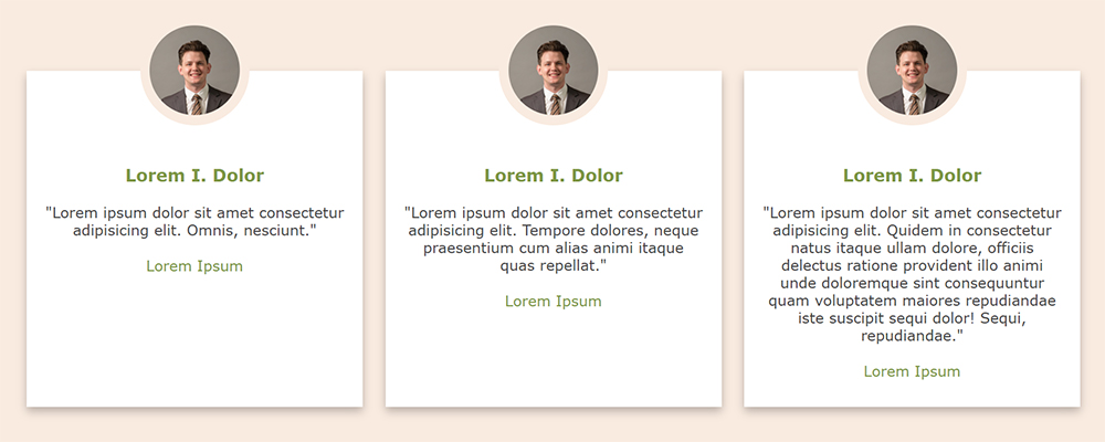
The next issue I was presented with after recording the build video. I originally tested with the exact same placeholder text in each of the three boxes, so they scaled in perfect balance. However, you can see below that with different lengths of text (not ever power statement will be the same), they warp in a displeasing fashion.
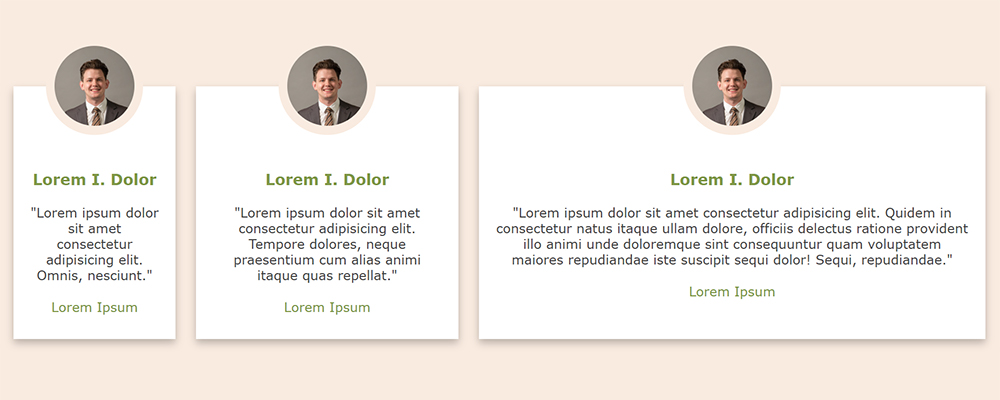
My first thought was enforcing a maximum width for each element in the container was the solution but what to set the value?
I did some quick math assessing the max-width of the container (1200 pixels), the left and right padding (20 pixels each), and the in-between padding (two bands of 25 pixels). We were left with 1100 pixels, which, divided 3 ways, was a nice round 370 pixels. This would be the max-width of each white box.
See the below code snippet and the added "max-width" property:
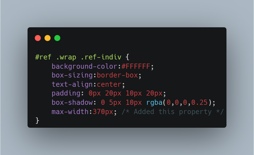
With this property added, when the screen gets big and the white box wants to expand to the left and right, it'll be stopped at a max of 370 pixels while the others catch up. This will also work nicely should I only have one or two cards instead of the three, so they don't get unnecessarily wide.
I will have to adjust the math or alter the approach if I want more than three references displayed (I don't foresee the need but an important note).
A quick test with different lengths of text will confirm.
And there we have it. Now we just need only fill in the photos, names, links, quote, and company/position for the three cards once I get permission from my references. Be on the lookout for these to appear on the home page of my portfolio website.
As a novice in the web development arena, this was a nice win. I was able to take my vision and craft it into a reality with just the knowledge I currently have. Much of the website build to this point has relied heavily on tutorials.
I'm looking forward to expanding my skills and particularly interested in improving my JavaScript abilities. I'm looking forward to that foundation so I can begin to familiarize myself with visualization packages like D3.js and chart.js.
Stay tuned for more web adventures amidst more data-focused projects.